Tuesday, October 30, 2012

Happy Glamoween!!!


Every one's crazy about halloween parties!
but halloweens need not to be really scary it could be glamorous!
so go ahead and strut your scary costumes and turn it to something G-L-A-M-O-R-O-U-S!!!

HAPPY GLAMOWEEN EVERYONE!!!

and boy we got a surprise for you!!
you can download this free printable here

and that's not all we also included this free downloadable fonts:

ENJOY!!!

p.s. the pumpkin's from pinterest

Thursday, October 25, 2012

Classic Christmas: Spontaneous Christmas Tree Styling

yesterday we were surprised by a visit of one of our clients,
we did their 2nd floor residential house before,
she wanted us to visit it again to glam up their third floor for a party this coming weekend.
we were just suppose to check some displays and some pillows she added as accents on some sofa.
when we got there the 2nd floor was still nice and glamorous as when we left it after photo shoot.
and then the client started talking about Christmas trees and ornaments.
and when she found out that we can also style up their Christmas tree she was as excited as we were.
and our visit became an instant styling visit
the color for their Christmas Tree was red and gold, a classic Christmas color combination.

there were glitters and gold everywhere

their Christmas tree is a traditional green plastic pine tree with gold glitters on every tip

we started of with the lights but unfortunately some of the lights were not working so instead of a close speckles of light we adjusted it and had a much larger gap between them but still turned out neat.

we then work on with gold leaf and pretty flowers wrapped it around the Christmas tree with ribbons

and then scattered the remaining ornaments,

finding some dull spots were we can add up magic and glitter.

finally our tree styling is done.


The client was so happy she wanted to fill every spaces of the room with Christmas ornaments.

'till next Christmas tree styling

D-st.


Repost: from I lurve: pretty and calm


this is a post from my other blog page which I'd like to share with you guys!
so read on and enjoy! ^__^

pretty and calm
I'm more of a neutral girl when it comes to interior design and paints.
I'm more inclined with mocha, taupe, sand, gray
even in clothing I prefer blacks and grays. whereas when I was younger I love bright popping colors. hmm.. sign of aging?? noooooooo...
but I'm beginning to appreciate pastel colors that are soft and girly.
of course this is through the influence of my design partner Suzette who is overly obsessed with pastels and Parisian designs.
here are a few of my inspirations that made me all giddy with pastels.

look at the pretty colors!
 you can deny it all you want, but every girl had that pink phase 
(the love-hate relationship with the color pink)

this has the wonderful mixture of all the lovely pastel colors


and yes I also had this purple phase
back in high school when I want everything in purple,
i never thought an all lavender interiors can be this pretty 


blue is actually a feminine color.
I Love powder blue shade.
 a mixture of cream and blue tones gives a girly yet mature aura for a room


this spells fun but still demure


a little serious touch 
for those who are sharing their spaces with the man of their dreams


this is so me. 
I don't know whats with shiny shimmering objects but i get attracted to them quickly 

a calm sitting area with the use of powder blue-ish-gray-ish wallpaper, upholster and rug


 pastel and gold for a little glimmer 
not a bad idea huh?


aren't you still not inspired with all this wonderful pastel ideas for your spaces?
its all girly and pretty but you can't deny it,
 it calms us girls imagining ourselves sitting in one of these rooms!

'till my next interior post! ^__^


P.S. all images found here are by Ms. Ana Antunes. Such a wonderful designer. ^__^

Tuesday, October 23, 2012

LOVING PATTERNS

Designing a space doesn’t end with choosing the right furniture and hanging the right frames. We also need to keep in mind the other elements in design, such as color, light, texture and pattern.
And how else to play with texture in the simplest way?  By using patterns!
Patterns and texture are different things but visually they can be one and the same.
We loved DAMASK PATTERN last year. It was all over!


Its like damsk pattern invaded every nooks and cranny of the design world.
Rugs, wallpapers, curtains, furniture...


Towels, invitations, stationeries, even food, everywhere!


And now  new patterns are invading our interior world!

TRELLIS PATTERN


Trellis pattern are geometric shapes interwoven to create another pattern.
This pattern has the sophistication and classic look that damask pattern has but is not too girly.
One of the famous patterns today is one made by Kelly Wearstler
See how she combines geometric shapes?

CHEVRON PATTERN

this are patterns that looks like a nested letters "V" and sometimes called a herringbone pattern.

this pattern I'm also starting to love.


maybe because its an easy DIY next to stripes

MORROCAN PATTERN

there are quite a number of different moroccan patterns.
but this is the prettiest.
generally a morrocan pattern resembles an arabic/morrocan embelishment 
as seen on morrocan arcitectures and arches

 its quite similar to a quatrefoil 
but notice that a morrocan pattern such as this has a pointed top and bottom or sides either way


QUATREFOIL

its very famous in art, architecture and christian symbolism 
which are four overlapping circles with the same diameter.

Gothic and Renaissance era are rich with the use of this pattern it is usually seen on top of Gothic arches.
and now we are all loving it.


FRET

A lot of early civilizations loved and used this pattern,
Egyptians, Romans, Indians, Mayan and Aztec and lets not forget Greek.
"It is a running or repeated ornament, consisting of lengths of straight lines or narrow bands, usually connected and at the right angles to each other in T, L, or square-cornered G shapes." -encyclopedia Britanica


LATTICE

this is quite similar to the Trellis pattern but notice that lattice uses straight overlapping lines whereas with a Trellis pattern, it uses a combination of straight and curved patterns. 


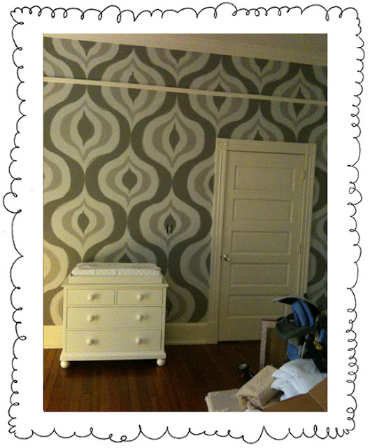
OGEE


this pattern is quite famous with wall papers,
 I haven't seen one being DIY'ed though for some obvious reason that it's quite difficult to make it yourself.
although I've seen this pattern during the 70's this is evident with my mom and dad's background pictures of their homes.

Ogee pattern is a curve shaped somewhat like an S, 
consisting of two arcs that curve in opposite senses, so that the ends are parallel. 
(according to wikipedia)

STRIPES

my all time go to when I'm bored with a wall
add a banner - this is a single stripe that we put on solid colored wall for accent
put on some stripes and viola!

Its quite neat to see the use of pattern in anything we can put our hands on,
it adds detail, interest and drama to one boring surface.
Hmm.. Maybe I could create one of my own.. soon.. ^_^
We’ll keep you posted
D-st.

sources: kaboodle.com, zee.com, paislequill.blogspot.com, Marmalade Interiors, Ferreira designs, Kelly Wearstler, houzz.com, lovinglifeandlilly.tumblr.com, tatertotsandjello.com, cuttingedgestencils.com, etsy.com, pinterest, wikipedia, indulgy.com, Ana Antunes, inspirebohemian.com, kippermillsap.blogspot.com, rougandco.com, Kelly Hoppen